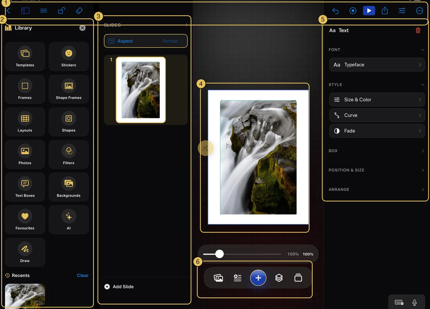
The three-panel workspace explained — Library, canvas and inspector, side by side.
No topics match — try a different word.
Your first five minutes
The iPad editor mapped out, then five small steps to a finished carousel.
The editor, at a glance
Every panel on screen, numbered and named.
1 — The top toolbar, in two rows: your way back, the project name, the menu, help and share up top; the panels, quick tools, erase, undo, redo, slideshow and format below.
2 — The Library: everything you can add, always at hand.
3 — The slide navigator: all your slides in a filmstrip.
4 — Your slide: the white page where everything lives.
5 — The inspector: tools for whatever you've selected.
6 — The toolbar: Photos · Text · Add (+) · Layers · Slides.
Panels that make way for your work
Columns when there's room, drawers when there isn't.
On a wide screen the Library, navigator, and inspector sit beside the canvas as columns. In a narrow window — Split View, Slide Over, or a smaller iPad held upright — they slide in over your slide as drawers instead, so the page never gets squeezed. A large iPad has room either way, so it keeps its columns even upright.
Step 1
Create a project
Start from the Projects screen.
A carousel is a set of pictures people swipe through, like an Instagram post with several pages. Tap the New Project tile — Krevez asks for a name, and you can leave it blank to have one chosen for you. Tap Create and a blank first page opens. It saves itself as you work.
Step 2
Put a photo on your slide
From your library, camera, or Files.
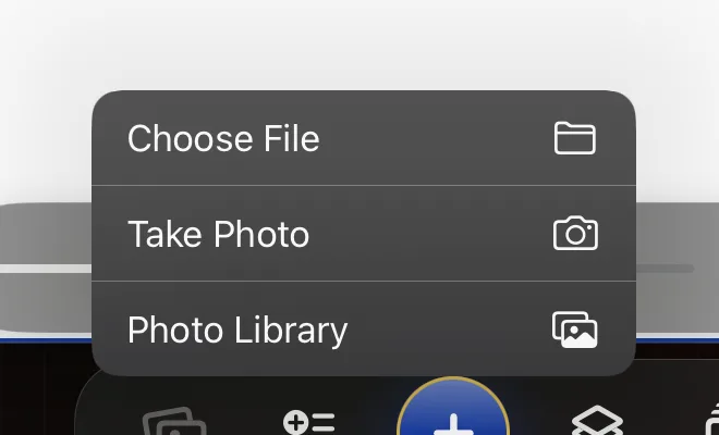
↳ Tap the Photos button in the bottom toolbar
Choose Photo Library and pick a picture. It lands on your slide, selected and ready to move or resize. (You can also drag a photo straight from another app onto the canvas.)
Step 3
Add your words
Type, then style in the inspector.
↳ Tap the Text button, next to Photos
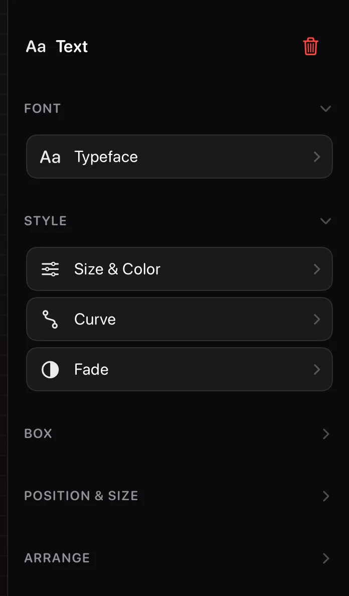
Type your text, then tap away to finish. While text is selected, the inspector on the right offers its tools: typeface, size and colour, curves, and more.
Step 4
Add more slides
The filmstrip on the left.
↳ Tap the Slides button, right end of the toolbar
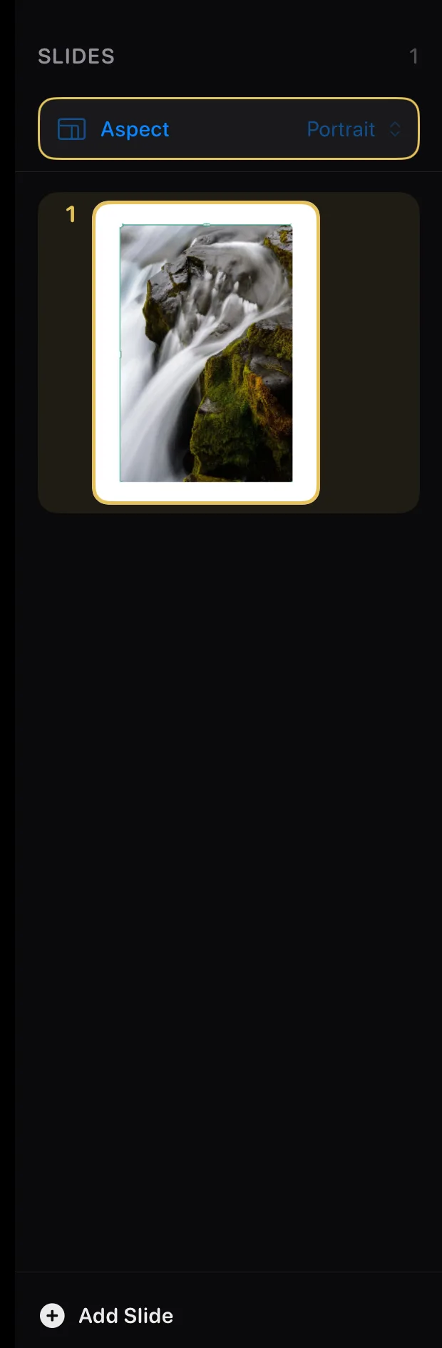
The navigator shows every slide as a filmstrip. Tap Add Slide at the bottom for a new page, tap any slide to jump to it, or drag to reorder.
Step 5
Share it
Ready to post.
↳ Tap Share in the top toolbar
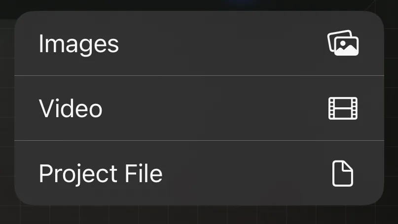
Choose Images and every slide is exported, ready to post anywhere. Video and Project File live in the same menu.
Every button, named
The toolbar across the top, and the floating bar under your slide.
The top toolbar, button by button
Two rows up top, plus two padlocks on the slide.
The top of the editor is two rows — document actions up top, editing tools below — and two padlocks float on the slide itself:
My Projects
Row 1. Back to your project library. Work saves itself.
Menu (☰)
Row 1. Settings, exports, and extras, including this Handbook.
Help (?)
Row 1. Open this Handbook, or replay the introduction.
Share
Row 1. Export as images, a video, or a project file.
Library
Row 2, far left. Show or hide the Library panel.
Quick Tools
Row 2. The wrench: the tools you've starred, filtered to whatever you've picked.
Erase
Row 2. Clear this slide, or start the whole project over.
Undo
Row 2. Take back your last change (⌘Z works too).
Redo
Row 2, beside Undo. Put back what you just undid (⇧⌘Z too); lit only when there's something to redo.
Slideshow
Row 2: view your slides full screen, record a build video, or save one as a video.
Format
Row 2, far right. Show or hide the tools panel.
Canvas lock
Floats at the top-left of the slide. Pin the canvas so a stray pinch or drag can't shift your zoom or your place.
Lock All
Floats at the top-right of the slide. Pin every item at once, so nothing moves while you work.
The bottom toolbar, button by button
The same five buttons as iPhone.
The floating bar under your slide is home base:
Photos
Bring in a picture from your library, camera, or a file.
Text
Add words to the slide.
Add (+)
Templates, stickers, shapes, backgrounds, and everything else.
Layers
See what's stacked on the slide, front to back.
Slides
Open the slide navigator filmstrip.
If a save ever fails
The red word in the top bar is a button.
↳ Top bar → the centre status
Krevez saves as you work and shows nothing when it succeeds. If a save can't finish, a red status word appears in the top bar — tap it to try again. A brief "Saving…" can also flash there while a big change is written.
Touching things
The canvas itself: selecting, moving, holding down, zooming, and the padlock.
Select, move, resize, rotate
Everything responds to your touch.
Tap anything once to select it, and a teal box with handles appears while the inspector fills with its tools. Drag to move, pinch to resize, twist two fingers to rotate, or type exact numbers in Position & Size.
Hold down for quick actions
Lock, duplicate, or delete anything.
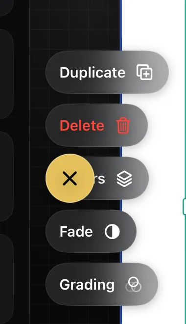
↳ Press and hold any item on the slide
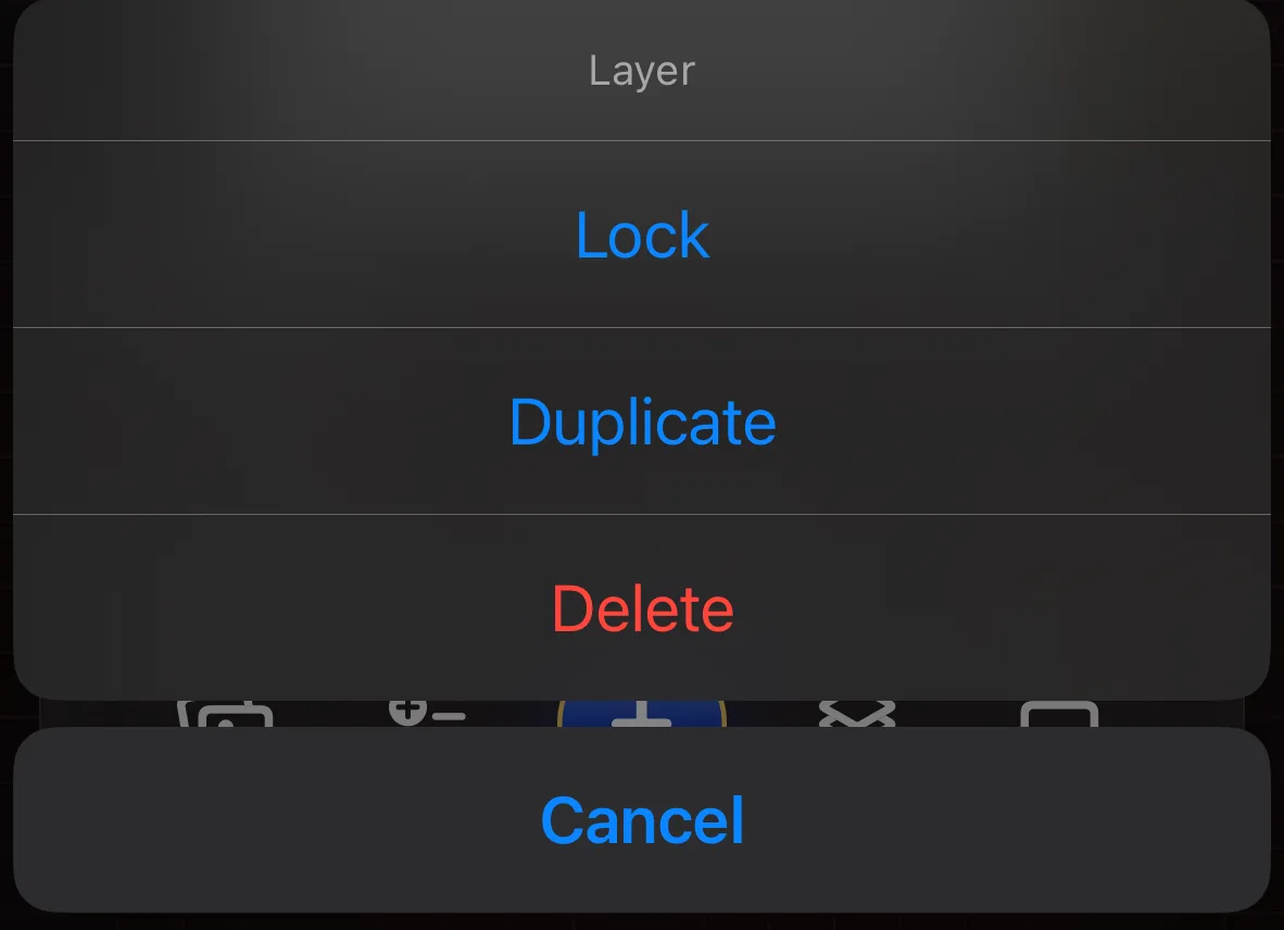
Press and hold any item for half a second and a Layer menu appears: Lock pins it in place, Duplicate makes a copy, Delete removes it. Frames, layouts and templates also offer Merge frames, and text you have reshaped offers Reset box shape. The press works on a locked item too, so Unlock is always one press away.
Zoom, pan, and the zoom lock
Get closer without losing your place.
↳ The padlock floats at the top-left of the slide
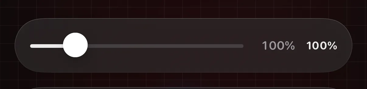
Pinch the canvas to zoom, drag with one finger to pan while zoomed, and double-tap to snap back to 100%. The open padlock floating at the top-left of your slide pins the canvas: while it is closed both the zoom and the position hold still, so nothing drifts while you work up close. If you would also like a zoom slider under your slide, switch on Show zoom slider in the menu — it greys out while the padlock is closed.
Drag photos in from other apps
Split View superpower.
Put Photos (or any app) beside Krevez and drag a picture straight onto the canvas. A highlight ring shows the slide will take it; the photo lands in the middle of the slide, ready to move.
Apple Pencil
Pressure changes your brush.
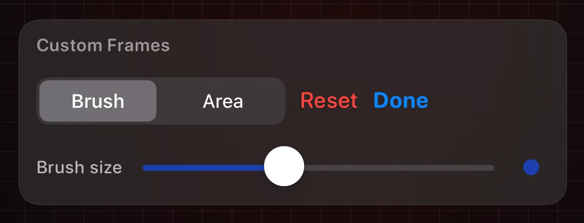
Anywhere you paint (fades, custom frames, drawing), pressing harder with the Pencil widens the stroke. A finger paints at a steady width.
Keyboard shortcuts & the menu bar
For hardware keyboards.
With a keyboard attached, Krevez adds a full menu bar — File, Edit, View, Insert, Arrange and Slideshow. The ones worth learning: ⌘N a new slide, ⌘Z undo and ⇧⌘Z redo, ⌘D duplicate, ⌘E export your images and ⇧⌘E share them, ⌥⌘P to view the slideshow and ⌥⌘R to record a build video, ⌃⌘I and ⌃⌘N and ⌃⌘L to show or hide the inspector, navigator and Layers, and ⌘] / ⌘[ to move the selection forward and back. Arrow keys nudge whatever is selected. Hold ⌘ to see the full list.
Everything you can add
The panel on the left, tile by tile — it stays open while you work.
The Library panel
Everything addable, always at hand.
↳ Tap the Library button in the top toolbar
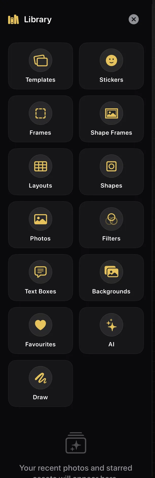
Everything you can add lives here as tiles, and the panel stays open while you work — so you can keep placing without losing your slide. Tile by tile:
Templates — ready-made designs you drop on and then fill.
Stickers — hundreds of cut-outs, by category.
Frames — shaped windows you add empty, then fill with a photo.
Shape Frames — cuts a shape-shaped window into a photo you already have (see below), plus phone and laptop shells.
Layouts — grids and rows that hold several photos at once.
Shapes — solid squares, stars, arrows, callouts and banners.
Photos — add a new picture, or reuse one you've already used.
Filters — ready-made looks and your own, applied to a photo you pick first.
Text Boxes — bubbles, cards, labels and chat threads.
Backgrounds — a colour, a texture, or your own pattern.
Favourites — everything you've starred, in one place.
Draw — freehand, on a pad or straight onto the slide.
On devices that support Apple Intelligence, an AI tile appears between Favourites and Draw. Your recent photos and starred favourites gather below the tiles.
Shape Frames needs a photo first
It cuts into a picture you already have.
↳ Tap your photo → Library → Shape Frames
Frames and Shape Frames sound alike and work opposite ways. A Frame is added empty and then filled. Shape Frames does the reverse: it cuts a shape-shaped window into a photo that's already on your slide.
So tap your photo on the canvas first. Open Shape Frames with nothing selected and the panel tells you so — "Select a photo on your canvas first" — rather than silently doing nothing.
The Devices chip at the top is the exception. Phones, tablets and laptops with see-through screens can be dropped straight onto the slide with nothing selected, and filled afterwards from the shell's ⋯ menu.
Star what you like, hide what you don't
And how to get a hidden thing back.
↳ Library → touch and hold any item
Touch and hold any item in the Library and two choices appear. Favourite stars it, and everything you star gathers behind the Favourites tile. Hide takes it out of the catalogue, which is how you thin out a category you never use.
Hiding is not permanent and it isn't a dead end: everything you've hidden is listed under ☰ menu → Hidden items…, and you can bring any of it back from there. If a sticker or a whole category seems to have vanished, that's the first place to look.
Browse and place
Tap to add, or drag it into place.
↳ Library → any category
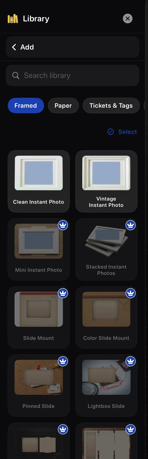
Open a category and tap any design to place it on your slide — the panel stays open, so you can keep adding. Tap the back arrow to return to the tiles. Categories, search, favourites and Pro crowns work just like the phone. Recent photos are the exception: drag one onto the canvas to place it exactly where you want.
Slide backgrounds
A colour, a texture, or your own pattern.
↳ Library → Backgrounds
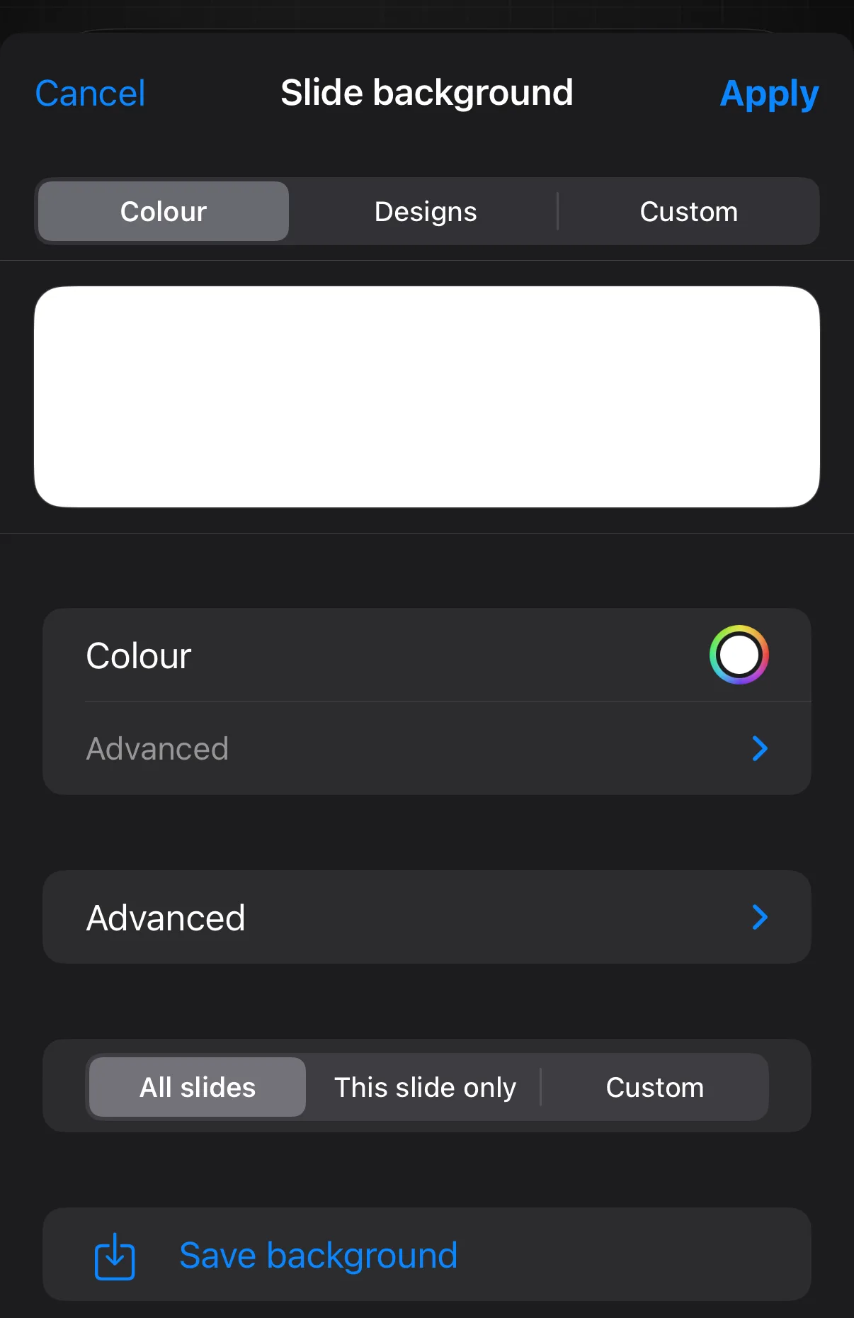
Colour picks any shade, Designs has ready-made textures, and Custom tiles one of your own images into a repeating pattern. Choose whether it covers every slide, this slide only, or a set of slides you pick. Your choice takes effect as you make it — close the panel when you are happy.
Recent photos & assets
Reuse, remove, or clear them.
↳ Library → Recents → Press and hold a photo
The Library's first panel keeps the photos and starred assets you've used, ready to drag back onto a slide. Press and hold a recent photo for Add to Slide or Remove from Recents, and use Clear to empty the whole strip — it asks first.
Cards you fill in
Some designs aren't just a layout — they're a card with its own quick editor. A card adds, moves, resizes and deletes like any layer, and each empty slot takes a photo. Its deeper Tools open from the Quick Tools wrench → More (add "More" to your Quick Tools first), or on an iPhone.
Editing a ready-made card
Add it here; open its Tools from Quick Tools → More.
↳ Library → Templates → add a card
Some Templates are a card you fill in — a comic strip, a tier list, a stat row, a poll, a colour palette. Add one from the Library's Templates and it drops onto your slide like any other layer: move, resize and delete it the normal way, and each card's empty slots take a photo with a tap. Its Tools — the rows and captions, values and labels, colours and covers made for that specific card — open from the Quick Tools wrench → More: add "More" to your Quick Tools once (☰ menu → Quick Tools), then select the card and tap the wrench → More. You can also edit it on an iPhone.
Comic panels (4-Koma)
A strip of panels with captions.
↳ Library → Templates → add 4-Koma
A 4-Koma card is a strip of panels — great for a before/after or a step-by-step. Drop a photo into any panel; set the panel count and each panel's caption from the Quick Tools wrench → More.
Tier lists
S, A, B, C rows to rank into.
↳ Library → Templates → add Tier List
A tier list is a stack of labelled rows. Drop photos into a row to rank them; set how many rows there are and rename each row's label (S, A, B…) from the Quick Tools wrench → More.
Stats, ratings & number badges
Numbers, stars, stamps, name plates.
↳ Library → Templates → add a stat or badge card
Cell-badge cards tag a grid of photos: Numbers, Stats (a big figure with a caption), Ratings (stars), Marks (a tap-to-cycle grid, handy for a habit tracker), Stamps, People (name plates) and Stages. Fill the photo cells, then set the layout, columns, header and row labels from the Quick Tools wrench → More.
Poll bars & timelines
Value bars, or a dated rail.
↳ Library → Templates → add Poll Bars or Timeline
A row-rail card is a list of rows: Bars mode gives each row a label and a value slider shown as a percentage, perfect for a poll; Timeline mode gives each row a date and a caption instead. Set the rows and their content from the Quick Tools wrench → More.
Cover & masthead text
Magazine-style title lockups.
↳ Library → Templates → add a cover card
A cover card lays big text over your photo — a masthead, a title and a tagline, with a Scrim slider that darkens the photo behind the words so they stay readable. Edit the lines and Scrim from the Quick Tools wrench → More.
Colour palettes
A row of named swatches.
↳ Library → Templates → add Palette Pull
A swatch card shows a palette, 3 to 8 swatches, each with its own colour and label, in Rounded, Circle or Square. Set the count, labels and shape from the Quick Tools wrench → More.
Callouts & pointers
Labels that point at your photo.
↳ Library → Templates → add a callouts card
A callouts card adds little pointers to a photo — 2 to 5 of them, each with its own text, dragged into place on the picture. Set how many and what they say from the Quick Tools wrench → More.
Hide-and-reveal covers
Blur, pixelate or silhouette a photo.
↳ Library → Templates → add Blur Reveal
An obscure card covers your photo for a reveal: pick the Cover — Blur, Pixelate or Silhouette — and the Reveal shape — Full, Band or Circle — plus an Intensity slider and a teaser Prompt line. Set these from the Quick Tools wrench → More.
Tools for what you've picked
The panel on the right, and the numbers behind every item.
Type exact positions and sizes
Pixel-perfect, keyboard-friendly.
↳ Select an item → Inspector → Position & Size
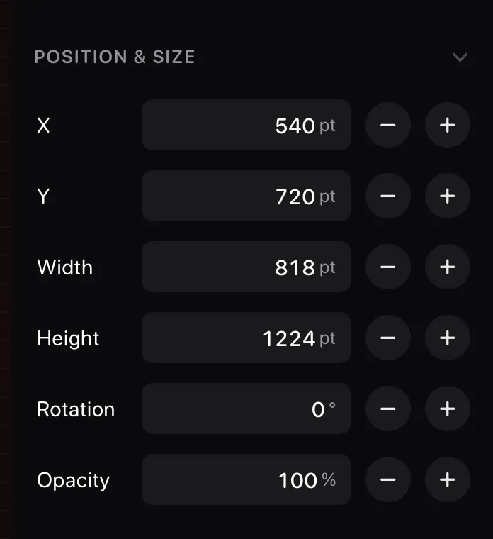
Position & Size in the inspector takes typed values: X, Y, width, height, rotation, and opacity, each with −/+ steppers. The fastest way to line things up exactly.
Working with photos
Everything the inspector offers once a photo is selected.
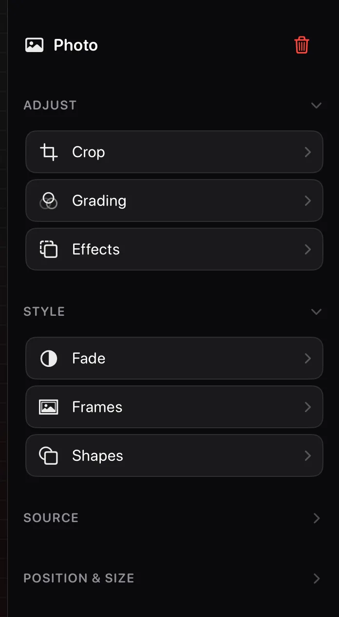
The photo inspector
Adjust, Style, and Source in one panel.
↳ Tap your photo → the inspector, right side
Tap a photo and the inspector offers everything: Crop, Grading, and Effects under Adjust; Fade, Frames, and Shapes under Style; replace and background tools under Source; exact numbers under Position & Size; and stacking under Arrange.
Its headings fold, and several start closed — tap a heading to open it. A tool that looks missing is usually just inside a closed heading.
The top of the panel names what you have selected, and the red bin beside that name deletes it — even a locked layer, since a lock now only freezes an item's position and size. Undo brings it back.
Crop or straighten a photo
Trim it, or level a crooked horizon.
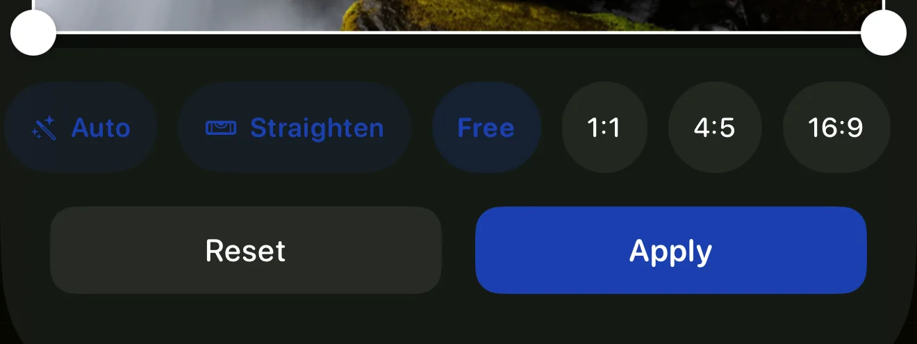
↳ Tap your photo → Inspector → Crop
Drag the corners to trim, or pick a fixed shape. Auto suggests a crop around your subject; Straighten levels the photo in one tap.
Filters & colour
One-tap looks, or fine control.
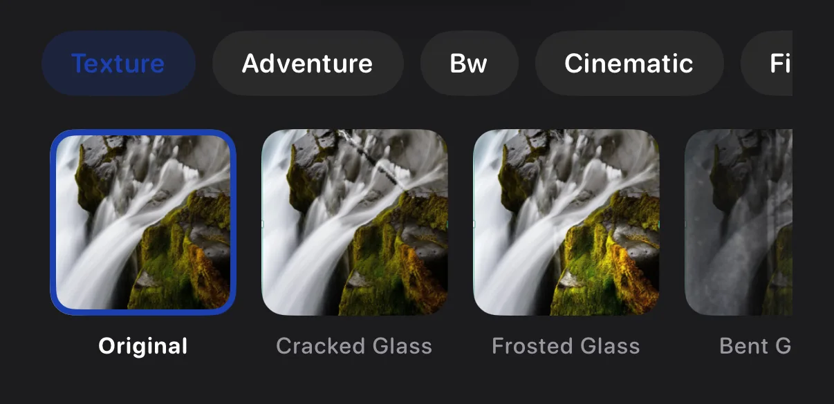
↳ Tap your photo → Inspector → Grading
The Filters tab has ready-made looks — two are free, the rest are a Krevez Pro feature (your own saved My Filters are always free). Colour Grading has Basic sliders for warmth and more, free for everyone, plus an Advanced section and a one-tap Auto suggestion that are both Krevez Pro. Save your own look as a filter.
Shadow, outline & corners
Give a photo some polish.
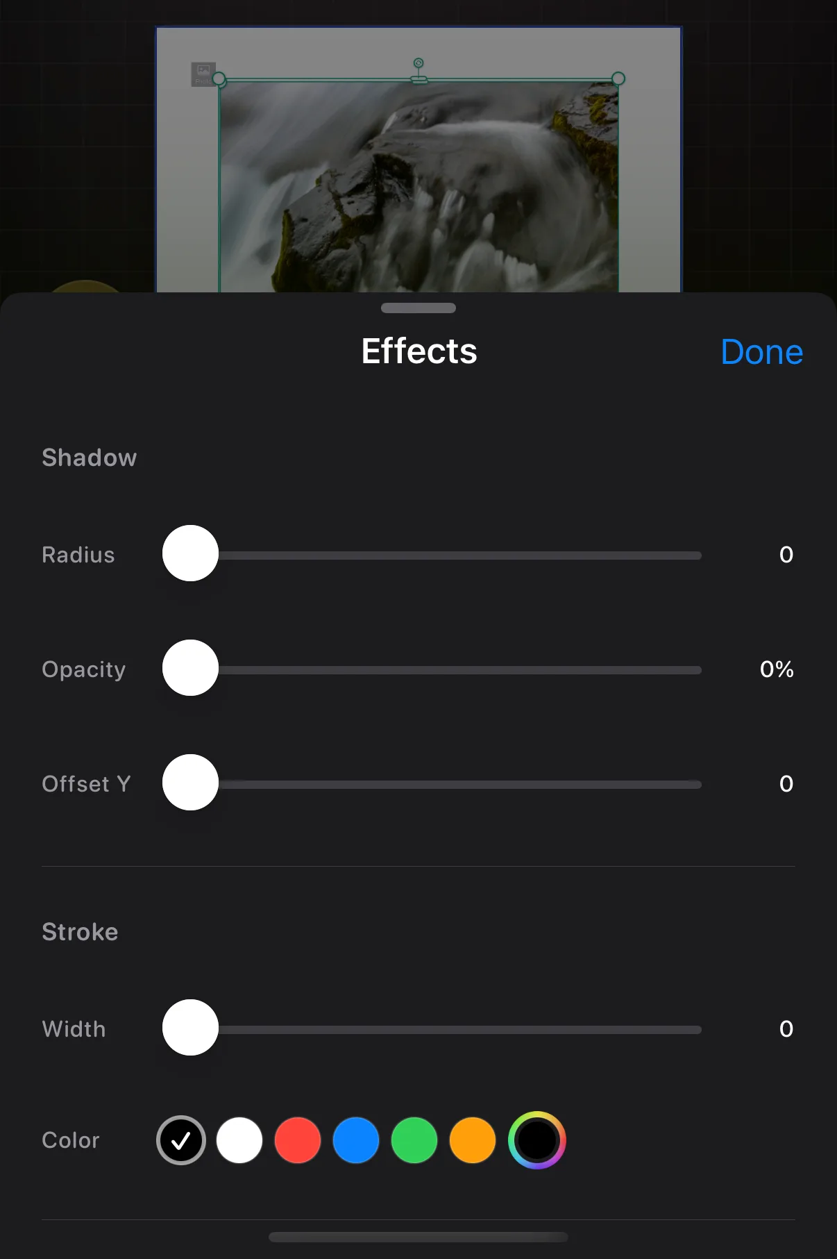
↳ Tap your photo → Inspector → Effects
Effects adds a soft shadow, a coloured outline, or rounded corners, each with its own slider.
Fade a photo
See-through, all over or in places.
↳ Tap your photo → Inspector → Fade
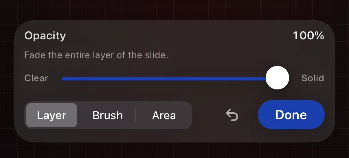
Layer fades the whole photo evenly, Brush paints the fade (Pencil pressure sets the width), Area fades a rectangle, and the wand fades the background automatically.
Background removal, stickers & more
The smart photo actions.
↳ Tap your photo → Inspector → Source / Style
Tap a photo and the inspector fills with its tools. Replace swaps the picture but keeps everything else. Cut Out lifts your subject away from its background. Sticker turns that subject into one you can reuse. Frame finds your subject and draws an outline box around it.
Flip a photo, or mirror it
Turn it around, or double it.
↳ Tap your photo → Inspector → Arrange → Flip or Mirror
Open Arrange in the inspector and two rows sit together that look alike but do different things. Flip turns the picture around where it stands, left to right. Mirror instead adds a reflected copy alongside the original, mirroring the left half onto the right. Each is a single tap — for the fuller set of directions (Vertical flip; Right, Above, Below or Quad Mirror), use an iPhone.
Frames, Shapes & Shape Frames
Three lookalikes, kept straight.
↳ Tap your photo → Inspector → Style → Frames or Shapes
Under a photo's Style, Frames cuts your picture into a shape you draw by hand, and Shapes cuts it into a preset shape — a heart, a star. The separate Shape Frames tile in the Library works the other way round: it cuts a shape-shaped window into a photo you've already placed. Frames and Shapes act on the selected photo; Shape Frames asks you to pick a photo first.
Put a photo in a device screen
Phones, tablets and laptops with see-through screens.
Shape Frames has a Devices tab — phones, tablets and laptops with a see-through screen. Drop one straight onto the slide with nothing selected, then fill its screen from the shell's ⋯ menu → Add photo to screen. A placed device also shows a Screen row in the inspector for the same thing.
Adding words
Everything the inspector offers once text is selected.
The text inspector
Font, Style, and Box in one panel.
↳ Tap your text → the inspector, right side
Tap your text and the inspector offers Typeface, Size and Colour, Curve, and Fade, plus Box styles, exact Position and Size, and Arrange.
Its headings fold. Font and Style open for you; Box, Position & Size and Arrange start closed — tap a heading to open it. If a tool seems to be missing, it is almost always inside a heading you have not opened yet.
The top of the panel names what you have selected, and the red bin beside that name deletes it. That bin is the inspector's delete — it removes even a locked layer, since a lock now only freezes position and size. Undo brings it back.
Change the font
Normal, decorative, or your own.
↳ Tap your text → Inspector → Typeface
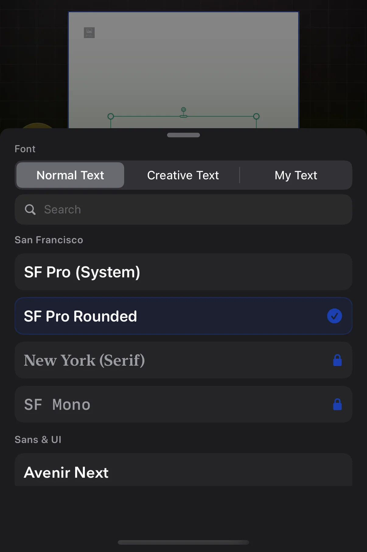
Normal Text is everyday fonts, Creative Text is decorative lettering, My Text is fonts you have imported. Normal Text is grouped into categories — tap a chip such as Basics or Bold & Loud to narrow the list, and your favourites sit pinned above it. Search works across all of them.
Size, colour & thickness
Make it bigger, bolder, brighter.
↳ Tap your text → Inspector → Size & Color
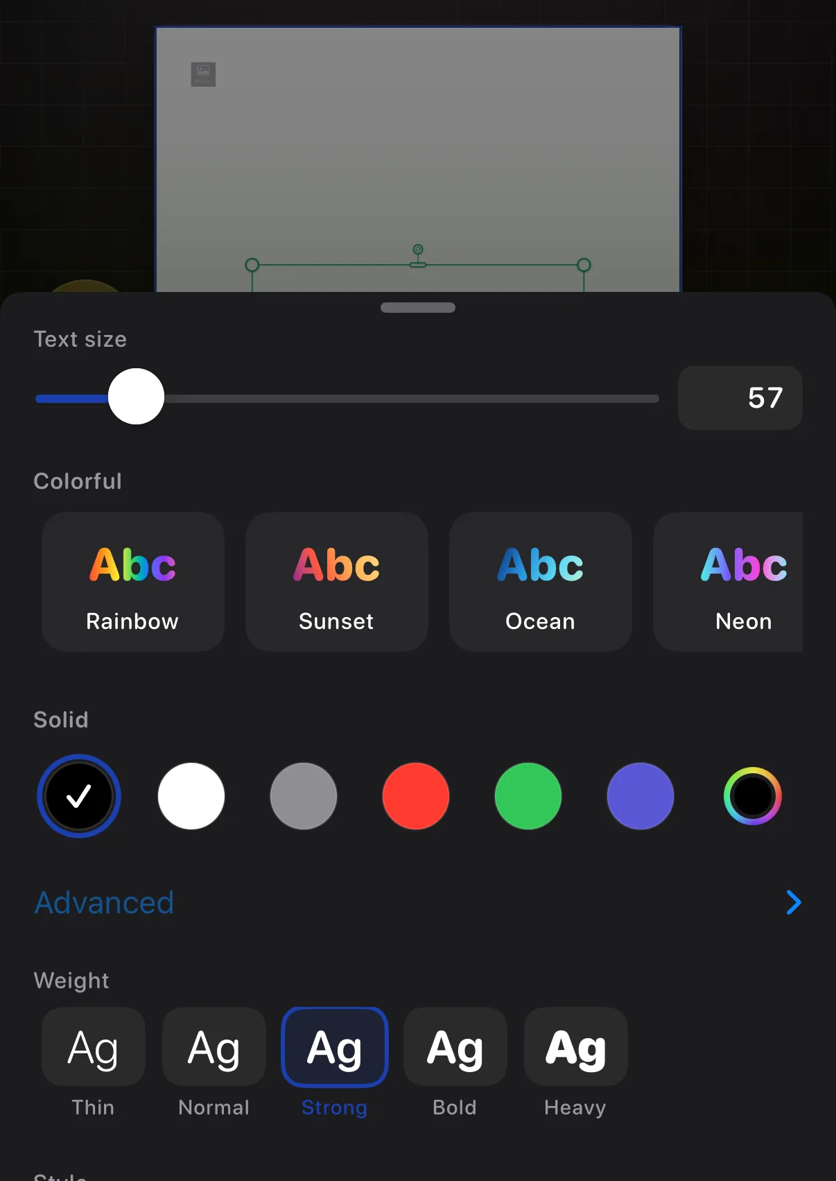
Size, solid colours and gradients, saved brand swatches, weight from Thin to Heavy, italic, underline, strike, and auto-fit.
Bend text into a shape
Arcs, rings, and your own curves.
↳ Tap your text → Inspector → Curve
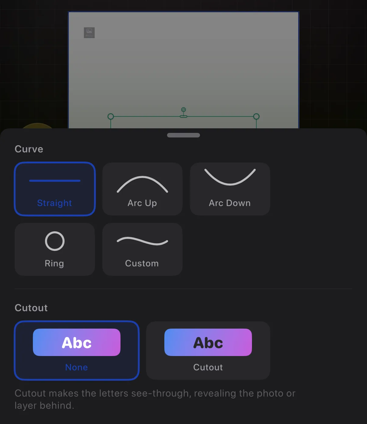
Curve bends your words into a shape: Straight, Arc, Ring, Wave, or Bump. Arc, Wave and Bump each get a slider for how deep the bend goes — drag it the other way to flip the bend over. A Ring is a full circle unless you narrow it into a band. Pick Custom to shape the line yourself: drag the dots on the canvas, and press and hold a dot to add or remove one.
Put text in a bubble or box
Chat bubbles, sticky notes, neon signs…
↳ Tap your text → Inspector → Box → Box
Open the Box group in the inspector and tap the Box row. A picker slides up with three categories — Comic for speech, thought and burst bubbles, Labels for tags and price cards, and Plain for simple boxes — plus a search. Tap a style to wrap your words in it, or None to take the box back off.
The box moves and resizes with the text, so you style the words once and the container follows.
Translate your text
Built-in, on-device translation.
↳ Tap your text → Inspector → Box → Translate
The Translate row sits in the same Box group. Tap it and Apple's translation panel opens for the selected text — pick a language and replace your words with the translation.
The row does nothing on empty text, so type something first.
Fake chat conversations
Build a message thread, bubble by bubble.
↳ Select a chat → Inspector → Messages → Chat
Add a chat from the Library's Text Boxes, then build it from the inspector's Messages section — the Chat row. Add message drops the next bubble on the opposite side to the last one; long-press it for an explicit Add Sent or Add Received, and each bubble has a Me/Them toggle. The extras hold ticks, a typing bubble, timestamps and per-bubble reactions, and a Received toggle flips a bubble to the other side. Continue on next slide carries a long conversation onto a fresh slide.
Warp a text box's corners
Tilt a label like it's seen at an angle.
↳ Tap your text → Quick Tools (⚡) → More → Warp corners
With Warp corners on, drag any corner of the text box to tilt and stretch it, like a label photographed at an angle. Reset box shape puts it back. It's only on plain text and the plain rectangle box — picture-style bubbles (speech, sticky notes, chat) can't be warped — and the corners go back to plain resizing while the text is on a Custom hand-drawn bend.
Bring your own fonts
Import typefaces from Files.
↳ ☰ menu → Custom fonts…
Custom fonts… imports your own .ttf, .otf or .ttc typefaces — up to 25 — so they appear alongside the built-in ones in the font picker. They travel with the project when you export it as a Krevez file.
What's on top of what
Your slide is a stack of layers. This is where you see and rearrange it.
Layers: what's on top of what
Your slide, taken apart.
↳ Tap the Layers button in the bottom toolbar
Everything on a slide sits in a stack, like sheets of paper. Tap Layers in the bottom toolbar and that stack takes over the middle of the screen — your slide hasn't gone anywhere, and the same button (now a ‹ arrow) brings it back. The inspector stays where it is on the right, so you can keep adjusting whatever you pick.
You get two views of the same stack. On top, your slide is tilted and pulled apart so you can see the sheets separately. Underneath is a list, one row per layer, with the frontmost at the top. Drag a row by the grip on its left to restack it.
Each row carries three controls: a pencil to edit that layer on its own, an eye to hide it, and a padlock to pin it. Background sits at the bottom with a small padlock and none of the three — it's the slide itself, so it can't be reordered, hidden or removed.
Change the view, or pick several at once
The buttons beside the title.
↳ Tap Layers → the buttons beside the title
View: exploded is a button, not a label — tap it to swap between the pulled-apart 3D stack and a flat, straight-on view. Flat is easier when the tilt makes a layer hard to recognise.
The eye beside it hides or shows every layer at once, which is the quickest way to see what's underneath something. The last button turns on selecting, so you can tick several layers and act on them together.
Hide a layer without deleting it
Get it out of the way, keep it safe.
↳ Tap Layers → the eye on any row
Tap the eye on any row and that item disappears from the slide. It isn't deleted — tapping the eye again brings it straight back, and Hide in the inspector's Arrange section does the same job.
Hidden layers stay hidden in your exports, so this is the safe way to park something you're unsure about rather than removing it.
Edit one layer on its own
For anything buried in the stack.
↳ Tap Layers → the pencil on any row
Tap the pencil on a row and everything else steps aside, leaving that one item by itself. Nothing else can be grabbed by mistake while you work, and all the normal tools still apply. Tap Done when you're finished and the rest of your slide comes back.
The pencil opens a locked layer too — a lock now freezes only its position and size, so you can still edit its content here.
When one item spans several slides
Borrowed rows, and why they're greyed.
↳ Tap Layers → a borrowed row
If an item stretches across more than one slide, it shows up in Layers on every slide it touches — but only the slide that owns it can move, hide or lock it. On the other slides it appears as a borrowed row, tagged "from slide N" and without the eye, lock or grip. The ‹N · N› chevrons on the row step you between the slides it spans. To reorder or hide it, go to the slide that owns it.
Your slides
The filmstrip navigator, the carousel's shape, and starting over.
The slide navigator
Your whole carousel in a filmstrip.
↳ Tap the Slides button in the bottom toolbar
Every slide, in order, beside your canvas. Tap to jump, drag to reorder, Add Slide for a new page — free projects stop at two slides, and Krevez Pro removes that cap — and press and hold a slide to duplicate, move or delete it. The Aspect chip at the top sets your carousel shape: square, portrait, and wide stay free, and a custom size you type in is a Krevez Pro feature. On a project you have already worked on, changing it saves what you have and opens a fresh project at the new size, so pick your shape early.
One photo across several frames
The "peephole" trick.
↳ Press and hold a frame or layout → Merge frames
Press and hold a frame, layout, or template and choose Merge frames, then tap the others and hit Merge. One photo shows through all of them. Select the merged group and tap Unmerge to undo.
Start over
The eraser in the top toolbar.
↳ Tap Erase in the top toolbar
Erase asks whether to clear just this slide or every slide. It always asks first, and Undo can bring things back.
View, record, export
The round button by the bottom toolbar, and its three choices.
Record your canvas as you build
A making-of video for reels.
↳ Slideshow button → Record Build Video
Record Build Video, inside the Slideshow button, films your slide while you edit. It works on single-slide projects only, so on a carousel with several slides the button will not start — trim down to one slide first. Stop when you are done, pick playback speeds per section, and save the video.
Getting your work out
Exports, and saving a design to start from next time.
Export your carousel
Images, a video, or a project file.
↳ Tap Share in the top toolbar
Images saves every slide as pictures, Video renders a slideshow clip, Project File packages everything for another Krevez. The share sheet opens as a popover near the top of the screen.
Save a design to reuse
Your layout, again and again.
↳ ☰ menu → Save as Template
Save as Template keeps this project's whole design in your Templates. Next time, start from it instead of a blank page. Export format (JPEG or HEIC) lives in the same menu.
JPEG or HEIC?
The image format your exports use.
↳ ☰ menu → Export format
Export format sets how your images save. JPEG opens everywhere — the safe choice. HEIC makes smaller files that modern iPhones, iPads and Macs read happily. If you're unsure, stay on JPEG.
Every row in the menu
The popover behind ☰, walked in the order it appears on screen.
The ☰ menu
Five groups, in a popover.
↳ Tap Menu (☰) in the top toolbar
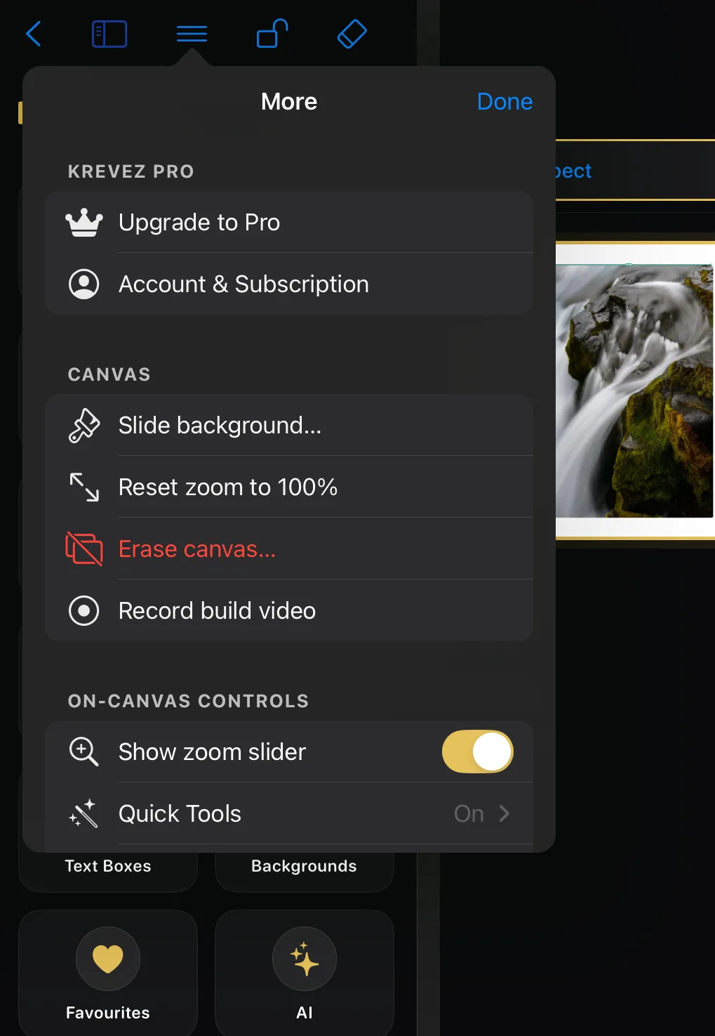
Everything that isn't a drawing tool lives behind ☰, in a popover that opens beside the button, in five labelled groups. Krevez Pro is your account. Canvas is what happens to the slide itself. On-Canvas Controls are the optional helpers that float over your work. Project covers saving and exporting this carousel. App is the whole app — including Help, which is how you got here. The next few pages walk each group in the order you'll see it.
Krevez Pro & Canvas
Your account, then the slide itself.
↳ ☰ menu → Krevez Pro · Canvas
Upgrade to Pro and Account & Subscription sit at the top — see What's free, what's Pro below.
Then Canvas, which acts on the slide you're looking at. Slide background… opens a picker with three tabs — Colour, Designs, and Custom. Reset zoom to 100% undoes any pinching and puts the slide back at its true size. Erase canvas… is red because it clears your work — it always asks first, and Undo brings it back. Record build video starts the making-of recording; it's here while your project is a single slide.
On-Canvas Controls & Project
Two switches, plus Quick Tools — then saving and exporting.
↳ ☰ menu → On-Canvas Controls · Project
Show zoom slider adds a slider for zooming without pinching. Quick Tools comes next — a drill-in, not a switch: it opens its own page where you star the tools you want on the wrench button in the top toolbar. Favourites star switches on the floating gold star. The two switches start off.
Project is about this carousel. Save as Template… keeps its design so you can start from it next time. Export Project File… packages the whole project — pictures, fonts and all — for another Krevez. Export format shows its current setting on the right. Custom fonts… is where you bring your own typefaces in. Hidden items… is the way back for anything you've hidden from the Library.
App
Sync, haptics, help, and the legal bits.
↳ ☰ menu → App
iCloud Sync tells you whether your projects are following you between devices. Krevez can't switch iCloud on for you, so the row hands you a Settings button that opens the right place in the Settings app. Haptics turns the little taps you feel on and off. Help opens this Handbook. Replay Introduction runs the welcome cards again from the start. About and Font Licenses hold the version, the legal documents and the typeface credits, and Learn more at krevez.com opens the website.
What's free, what's Pro
The crown badges explained.
↳ ☰ menu → Upgrade to Pro
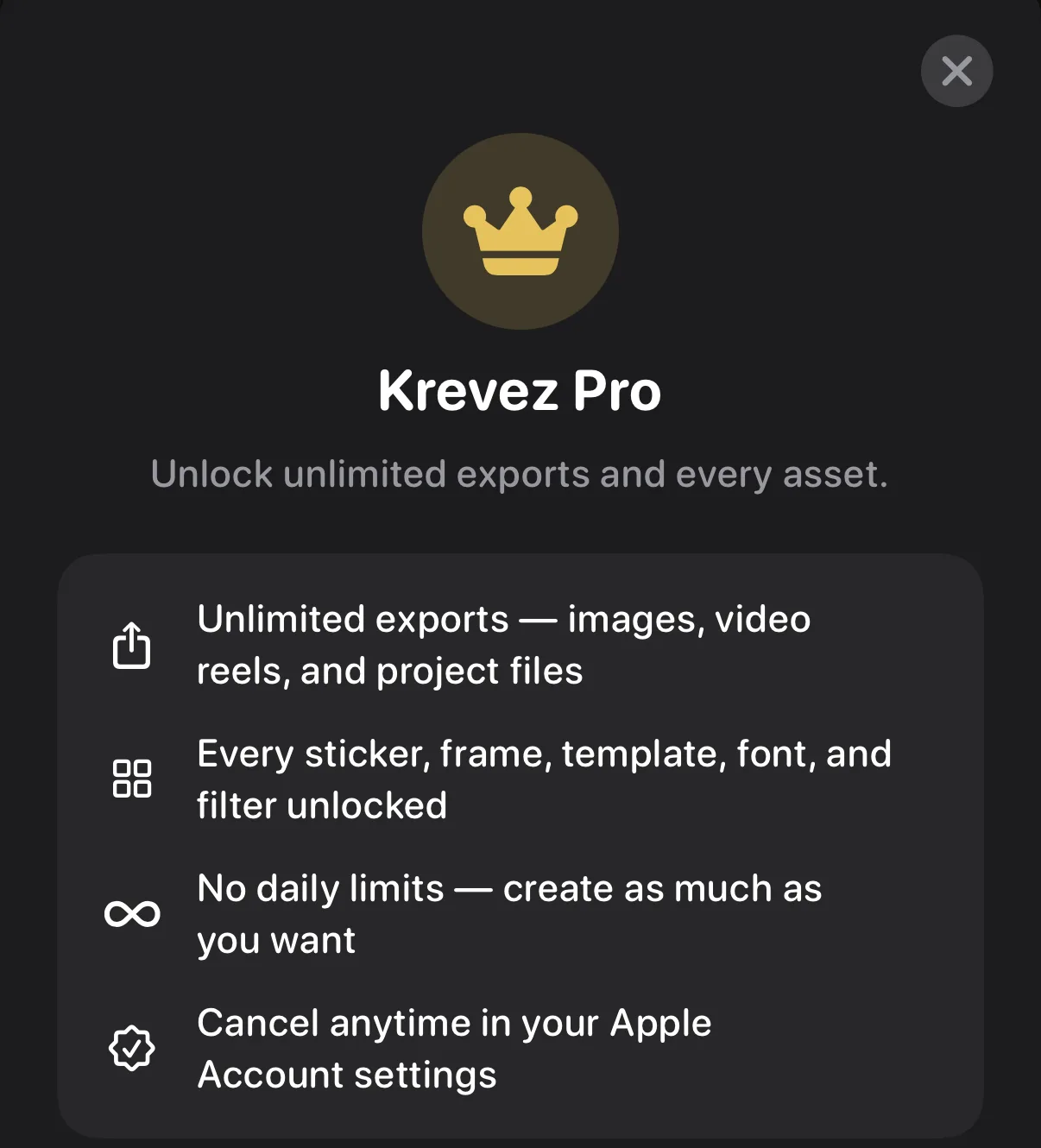
Free gives you the first designs in every category, two filters total, and a daily export allowance shared across images, video, Build Video, project files, and Chat Replay. New projects are capped at two slides, a typed-in custom aspect ratio is Pro, and so are Colour Grading's Advanced sliders and the Auto suggestion. Items with a crown badge, and every limit above, come with Krevez Pro: monthly, annual, or lifetime. One purchase covers iPhone and iPad.
Downloading your Pro assets
Get every premium item onto your device.
↳ ☰ menu → Krevez Pro
When you go Pro, Krevez fetches all the premium stickers, templates, frames and backgrounds so they're ready even offline. On Wi-Fi it happens automatically in the background — a small "Downloading your Pro assets" bar sits under the top tools and disappears when it's done. On cellular nothing downloads automatically; tap any locked item wherever you're using it to fetch just that one pack. You can always check progress from the ☰ menu, and on Wi-Fi you can start or resume the whole download from there too.
Quick Tools: your shortcuts
Your favourite tools, one tap away.
↳ Inspector → Quick Tools (nothing selected)
Star the tools you use most and the Quick Tools button — the wrench in the top toolbar — keeps them one tap away. It shows only the tools that suit whatever you have selected.
Back at your projects
The screen outside the editor, where every carousel lives.
The Projects screen
Sidebar, search, folders, drag-out.
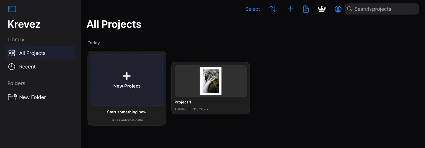
All Projects and Recent live in the sidebar, with your folders below. Drag a project onto a folder to file it — filed projects move out of All Projects and into that folder. Search, sort, import, and your account sit in the toolbar.
Folders & tidying up
A series, a client, a theme.
↳ Projects sidebar → New Folder
New Folder in the sidebar creates one; drag projects in, or use Select to move or delete several at once. Everything saves as you work, and syncs with iCloud when it is switched on.
Rename, duplicate or share one project
Everything you can do without opening it.
↳ Projects → touch and hold a project
Touch and hold any project tile and its own menu appears, in this order: Rename gives it a new name. Share saves the whole project as a Krevez file you can send to someone or keep as a backup — pictures, fonts and all. Duplicate makes a copy, so you can try something without risking the original. Move to… files it into a folder. Delete, in red at the bottom, removes it.
This is the only way to rename a project after you've made it, so it's worth knowing before you end up with a shelf of projects all named the same thing.
Words you'll see
The terms the rest of the Handbook uses, in plain language.
Plain-words dictionary
Carousel, slide, inspector, and friends.
Carousel — a post made of several pictures people swipe through.
Slide — one page of your carousel. The white page is the current slide.
Canvas — the working area where your slide sits.
Layer — one item on a slide (a photo, some text, a sticker). Layers stack, so one can sit in front of another.
Inspector — the right-hand panel of tools for whatever is selected.
Template — a ready-made design you can start from or save yourself.
Pro — the optional subscription that unlocks every asset and unlimited exports.